Anyone who lives in the Ditmars neighborhood of Astoria, Queens will speak fondly of El Rey Del Taco, a neighborhood favorite food late night food truck that often has a line down the block. However, it isn’t the only place in the area; in fact, there is another much less popular taco place 50 yards away. What makes El Rey del Taco great (besides the life-changing carne asada) is the location. You can find it on the corner of Ditmars and 31st St where the Q train lets out, perfectly poised to capture party-goers trudging back from Manhattan bars.
Despite how much New Yorkers love their favorite food trucks, the City of New York has set hard limits on the number of them allowed, to curb noise and air pollution from their gas-powered generators. This poses the question: If only a few thousand food trucks can legally operate at any given time, what is the best real estate. How can they best optimize their locations to maximize sales? While spots like the major subway stops are no-brainers, most of these sites have already been claimed. On top of that, the city plans to increase the number of permits substantially over the next several years, and these carts will need to find new spots.
Can location data from mobile devices provide a reasonable proxy for the concentrated volume of potential customers? Using a public Uber dataset, we looked at all the pickup and drop off points that occurred over a 3-month time window within Manhattan. Obviously, this data set doesn’t capture all people on the move (pedestrians, Yellow cab riders, bikes, etc.,) but it roughly reflects high traffic locations in NY and thus can be a primer for food truck locations.

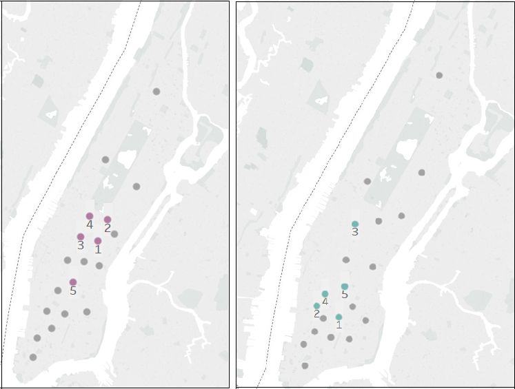
The data set comes in the form of spatial coordinates. A heat-map of all pickups will show the expected: Manhattan is a very busy place. To yield more exact results, we used a K-means clustering algorithm to pinpoint cluster centers within the traffic data. The underlying idea is that a cluster center generated from this dataset would generate spots on the map that minimize distances between pickup points, indicating locations with ideal points to set up food carts to access the highest number of customers. Once we assigned each pick-up data point to a cluster (Figure 1), we ranked the clusters based on pickup volume (Figure 2).
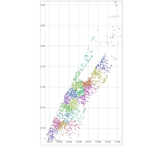
As you can see from Figure 1, there are significant differences between the cluster centers and the top-ranked points at different times. While the main centers of pickups are around Greenwich Village and Lower Manhattan on Thursday evenings, late on Saturday night the traffic centers around Midtown. Especially for smaller, fully mobile carts (think ice cream trucks with a driver or Italian ice carts), this kind of information could help tell operators where to go to take advantage of Uber customers. Nevertheless, using a k-means has shortcomings. The distance is Euclidean and not along the actual roads, so it might be that a center seems close but in reality, it is not. Moreover, this assumes that Uber users are good food truck customers.
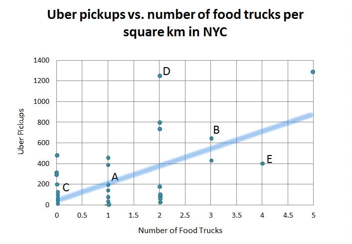
To test the hypothesis that there is a relationship between Uber pickups and food truck locations, we triangulated our Uber data with food truck location data scraped from Yelp. We then divided the city into a grid and determined how many total pickups and food trucks occurred in a given square kilometer. In each grid square, we calculated a ratio of Uber pickups to the number of food carts.
While we found that there was a positive trend between the number of pickups and the number of trucks in a given area, a multiple linear regression revealed that the relationship was not significant; in other words, while Uber pickups increase in a given area so do the number of food trucks (see the upward trend in Figure 4), but you can’t predict the number of food trucks by the number of Uber pickups with statistical significance. Thus, based on this model alone we can’t confirm that Uber pickups create a good signal for food cart locations. While Yelp was the largest and most complete data set on food truck locations that we could find, there may be food trucks that do not appear on the site. This could explain some of the lack of significant correlation. Regulations about where food trucks can operate might also influence the results. On the Uber side, there are other transportation methods that cannibalize Uber traffic like subway stops, which is another variable not captured in our model.
This lack of correlation could have a few interpretations: there are unexplained variables in this data (other forms of transportation skew the results), our initial assumption that Uber users are good food truck customers is off, or that food truck locations are not optimized to meet this source of demand.
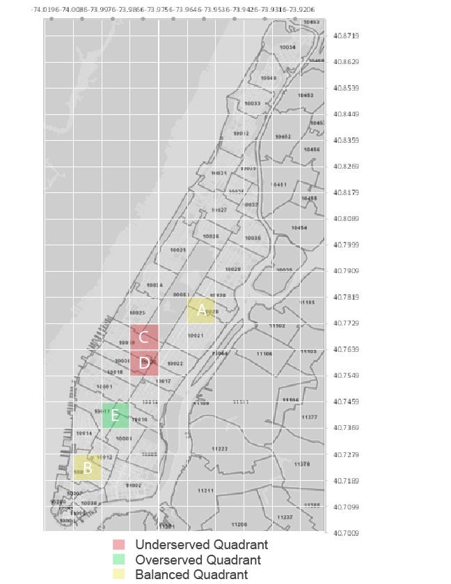
If we maintain the assumption that Uber users are good food truck customers, we can use our trend analysis to determine whether certain areas are under- or over-served by food carts. For example, while a spot known to have good foot traffic might have several food trucks, is the ratio of food trucks to the number of pickups high or low? This could give us a sense of how well balanced the supply of food trucks is given the demand generated by Uber customers. Then, potential food truck operators could use this information to spot areas where supply might not meet the potential demand.
As you can see from Figure 4, there are areas where the trendline predicts roughly how many food trucks can be expected based on the number of Uber pickups (points A and B). However, there are points where there are an average amount of Uber traffic but zero food carts ©, above average Uber traffic with an average number of food trucks (D), and points with below average UBER traffic and a well above average number of food trucks (E). These disparities roughly define areas that may have an opportunity to better optimize food truck locations by either adding more carts to the system in underserved areas that may not meet demand and moving trucks away from overserved areas that may be over-saturated (see Figure 5).
With the proliferation of user-based apps that contain valuable insights around how individuals interact and move around, business decisions can increasingly be driven with data. This analysis provides one perspective on how app data from sources like UBER can be used to inform seemingly unrelated businesses, showing the potential to incorporate external data sources in addition to internal ones. However, even combined data doesn’t always paint a complete picture. Sometimes a food truck is just so good it doesn’t matter where it is (or how bad the service is); it’ll always have a line.
This article was co-authored by Katherine Leonetti, who recently finished her MBA with a concentration in Sustainable Global Enterprise at the Cornell Johnson School of Management. She will be working for Citibank’s Technology and Operations division and located in Mexico City, where she hopes the carne asada will meet her high expectations. The original project was a collaboration with Katherine, Swapnil Gugani, Tianyi (Teenie) Tang, and Wu (Will) Peng, developed for the Designing Digital Data Products course at Cornell that Lutz Finger is teaching.
Lutz Finger is Data Scientist in Residence at Cornell. He is the author of the book “Ask, Measure, Learn”. At Snap & LinkedIn he has built Data Science teams.
This Article was originally published on my Forbes blog.
