Category Archives: Blog

Uber Data Determine The Best Food Places In New York City

Anyone who lives in the Ditmars neighborhood of Astoria, Queens will speak fondly of El Rey Del Taco, a neighborhood favorite food late night food truck that often has a line down the block. However, it isn’t the only place in the area; in fact, there is another much less popular taco place 50 yards away. What makes El Rey del Taco great (besides the life-changing carne asada) is the location. You can find it on the corner of Ditmars and 31st St where the Q train lets out, perfectly poised to capture party-goers trudging back from Manhattan bars.

Despite how much New Yorkers love their favorite food trucks, the City of New York has set hard limits on the number of them allowed, to curb noise and air pollution from their gas-powered generators. This poses the question: If only a few thousand food trucks can legally operate at any given time, what is the best real estate. How can they best optimize their locations to maximize sales? While spots like the major subway stops are no-brainers, most of these sites have already been claimed. On top of that, the city plans to increase the number of permits substantially over the next several years, and these carts will need to find new spots.

Can location data from mobile devices provide a reasonable proxy for the concentrated volume of potential customers? Using a public Uber dataset, we looked at all the pickup and drop off points that occurred over a 3-month time window within Manhattan. Obviously, this data set doesn’t capture all people on the move (pedestrians, Yellow cab riders, bikes, etc.,) but it roughly reflects high traffic locations in NY and thus can be a primer for food truck locations.

Best Food Truck Locations in NYC can be determined by data.


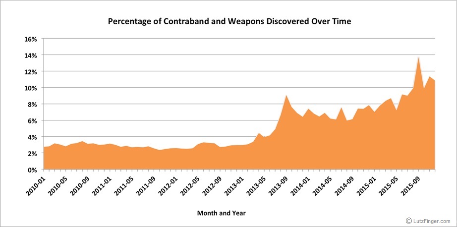
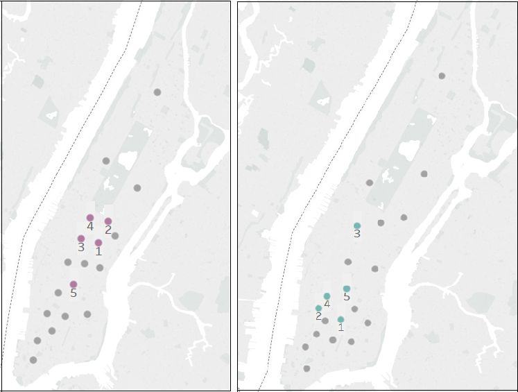
The data set comes in the form of spatial coordinates. A heat-map of all pickups will show the expected: Manhattan is a very busy place. To yield more exact results, we used a K-means clustering algorithm to pinpoint cluster centers within the traffic data. The underlying idea is that a cluster center generated from this dataset would generate spots on the map that minimize distances between pickup points, indicating locations with ideal points to set up food carts to access the highest number of customers. Once we assigned each pick-up data point to a cluster (Figure 1), we ranked the clusters based on pickup volume (Figure 2).

Figure 1: Pickups colored by cluster assignment


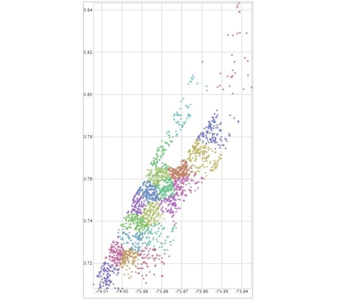
As you can see from Figure 1, there are significant differences between the cluster centers and the top-ranked points at different times. While the main centers of pickups are around Greenwich Village and Lower Manhattan on Thursday evenings, late on Saturday night the traffic centers around Midtown. Especially for smaller, fully mobile carts (think ice cream trucks with a driver or Italian ice carts), this kind of information could help tell operators where to go to take advantage of Uber customers. Nevertheless, using a k-means has shortcomings. The distance is Euclidean and not along the actual roads, so it might be that a center seems close but in reality, it is not. Moreover, this assumes that Uber users are good food truck customers.

Figure 2: Thursday evening vs. Saturday late night top ranked cluster centers.


To test the hypothesis that there is a relationship between Uber pickups and food truck locations, we triangulated our Uber data with food truck location data scraped from Yelp. We then divided the city into a grid and determined how many total pickups and food trucks occurred in a given square kilometer. In each grid square, we calculated a ratio of Uber pickups to the number of food carts.

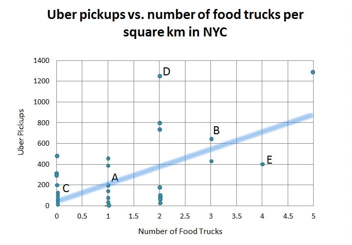
While we found that there was a positive trend between the number of pickups and the number of trucks in a given area, a multiple linear regression revealed that the relationship was not significant; in other words, while Uber pickups increase in a given area so do the number of food trucks (see the upward trend in Figure 4), but you can’t predict the number of food trucks by the number of Uber pickups with statistical significance. Thus, based on this model alone we can’t confirm that Uber pickups create a good signal for food cart locations. While Yelp was the largest and most complete data set on food truck locations that we could find, there may be food trucks that do not appear on the site. This could explain some of the lack of significant correlation. Regulations about where food trucks can operate might also influence the results. On the Uber side, there are other transportation methods that cannibalize Uber traffic like subway stops, which is another variable not captured in our model.

Figure 4: Number of Uber pickups vs. number of food trucks by square kilometer in Manhattan; each individual point represents a specific square kilometer space, located on the chart based on the number of Uber pickups and number of food trucks that fall within that area in a defined time frame.


This lack of correlation could have a few interpretations: there are unexplained variables in this data (other forms of transportation skew the results), our initial assumption that Uber users are good food truck customers is off, or that food truck locations are not optimized to meet this source of demand.

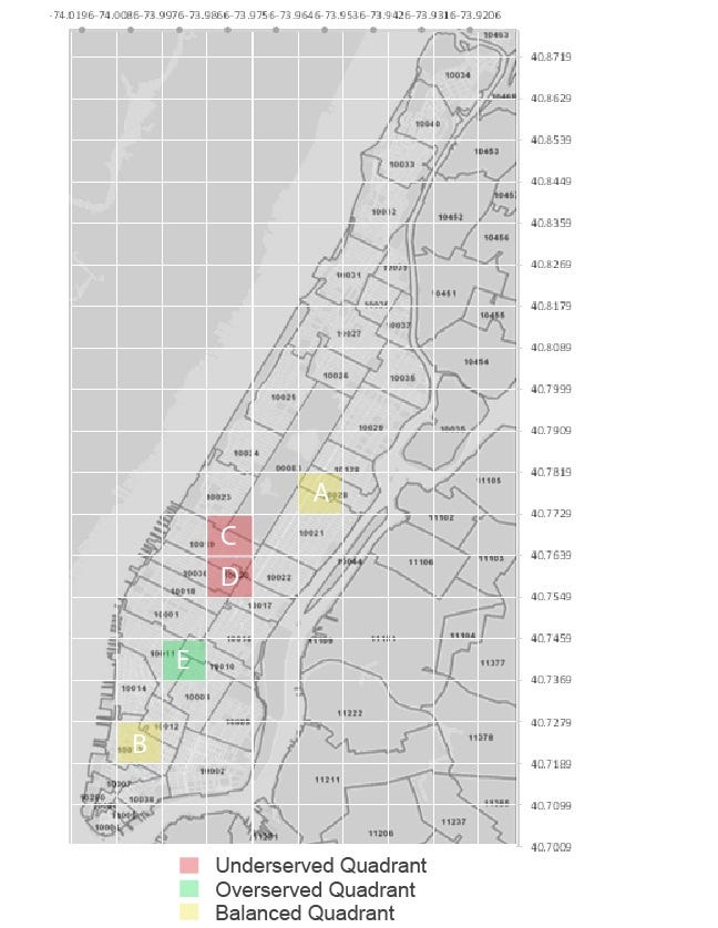
If we maintain the assumption that Uber users are good food truck customers, we can use our trend analysis to determine whether certain areas are under- or over-served by food carts. For example, while a spot known to have good foot traffic might have several food trucks, is the ratio of food trucks to the number of pickups high or low? This could give us a sense of how well balanced the supply of food trucks is given the demand generated by Uber customers. Then, potential food truck operators could use this information to spot areas where supply might not meet the potential demand.

As you can see from Figure 4, there are areas where the trendline predicts roughly how many food trucks can be expected based on the number of Uber pickups (points A and B). However, there are points where there are an average amount of Uber traffic but zero food carts ©, above average Uber traffic with an average number of food trucks (D), and points with below average UBER traffic and a well above average number of food trucks (E). These disparities roughly define areas that may have an opportunity to better optimize food truck locations by either adding more carts to the system in underserved areas that may not meet demand and moving trucks away from overserved areas that may be over-saturated (see Figure 5).

Figure 5: Under-/Over-served quadrants from Figure 4 mapped


With the proliferation of user-based apps that contain valuable insights around how individuals interact and move around, business decisions can increasingly be driven with data. This analysis provides one perspective on how app data from sources like UBER can be used to inform seemingly unrelated businesses, showing the potential to incorporate external data sources in addition to internal ones. However, even combined data doesn’t always paint a complete picture. Sometimes a food truck is just so good it doesn’t matter where it is (or how bad the service is); it’ll always have a line.

This article was co-authored by Katherine Leonetti, who recently finished her MBA with a concentration in Sustainable Global Enterprise at the Cornell Johnson School of Management. She will be working for Citibank’s Technology and Operations division and located in Mexico City, where she hopes the carne asada will meet her high expectations. The original project was a collaboration with Katherine, Swapnil Gugani, Tianyi (Teenie) Tang, and Wu (Will) Peng, developed for the Designing Digital Data Products course at Cornell that Lutz Finger is teaching.

Lutz Finger is Data Scientist in Residence at Cornell. He is the author of the book “Ask, Measure, Learn”. At Snap & LinkedIn he has built Data Science teams.

This Article was originally published on my Forbes blog.

How A Small Restaurant Can Use Its Data

How can small businesses leverage point of sale data to make informed decisions? Big Data sounds often like Big Business, but the power of data is available even to small businesses without extensive resources. Point of sale data coupled with Excel and basic statistical knowledge can be leveraged to drive informed decisions and make businesses data driven.

A group of Cornell University graduate students from my class “Designing Data Products” set out to help an iconic yet small family owned restaurant on the Jersey Shore to leverage its point of sale data, to make informed decisions around inventory management.

The Circus Drive-In Restaurant serves approximately 100,000 customers looking to explore the beaches in the summer. Due to its close proximity to the shore, the primary driver of customer numbers is the weather. “The unpredictability of the weather makes inventory management extremely difficult,” says Richard Rose, co-owner, and general manager. The restaurant’s top sellers are the fresh, made-to-order burgers. “We do not use frozen meat for our burgers”, says Rose.

The Circus Drive-In is a fast food hamburger drive-in restaurant that opened in 1954.

This approach makes the logistics even more challenging. If the restaurant overstocks its meats and has leftover inventory, the meat is not used and has to be thrown away, leading to spoilage costs. On the other hand, understocking of meat will lead to dissatisfied customers and lost revenue, both of which are detrimental to a seasonal business.

The restaurant manager manually tracks inventory usage on paper. The forecasting process is a combination of channeling the manager’s inner meteorologist, economist, and restaurateur. It is a gut feeling based on invaluable experience which helped get the business to where it is today. However, in the world of data ‘gut’ and ‘experience’ can be augmented by predictive data analytics.

The Cornell team created a model to predict demand for hamburgers. The model utilized point of sale data from 2015 and 2016, along with weather, seasonality, and holidays. Often getting data is a challenge. However historical weather data is particularly easy to obtain from web archives. The statistically relevant variables were maximum daytime temperature, average humidity, and the likelihood of thunderstorms. The holiday data was obtained from the website OfficeHolidays. Once the data had been collected, as usual, most of the work involved getting the data into the right format. The team had to spend some time to transform the data to make it usable, for example, converting holidays into Boolean dummy variables for the model.

Approaches to forecasting can range from simple moving averages via autoregressive integrated moving average (ARIMA) to probabilistic forecasting and ensemble forecasting. Often simpler algorithms and easy tools are powerful enough to get a quick win. In this case, the team used Excel with a XLMiner plugin. Not fancy but sufficient!

Running a regression is a two-step process. First, a partition process creates randomly selected training and test datasets from the original dataset. Second, a build and test process produces the regression model and performance metrics. The graph below shows how effective the model is by comparing under-estimation vs. over-estimation per season. To explain the graph, there are two curves, the Random Predictor and MLR Predictor, which when compared express the benefits gained by using the model. To ensure that the restaurant has sufficient hamburger inventory at all times, the restaurant will need to massively overstock, representing over 4,200 patties wasted. This is shown by the intersection of the Random Predictor (red curve) with the horizontal axis. If the restaurant is willing to run out of patties on occasion and experience accumulated lost sales of let’s say 500 hamburgers, it still would need to stock 3,800 patties more than needed. Using our model (blue MLR curve) under the same circumstances, the amount of waste can be reduced to 700 patties, saving 3,100 hamburger from being disposed of.

Under vs. Over-Estimation — Using A Random Guess vs. The Model

This frees up working capital, improves the baseline return and prevents food spoilage as well as freeing up the manager’s time to focus on the restaurant’s operations instead of gut-feel forecasting.

In the area of big data, we often forget that the success of data is often based on the actual questions. Small business owners know their businesses best, and know what to ask the data: in this case, “how can I stock hamburger meat up correctly.”

Small businesses often have good control of their data. If the wealth of information from their own point of sales system is not sufficient, one can easily merge publicly available data, as the team did with weather and holiday information. Often no complex tools are needed to make data work. With that, let’s get down to the beach of the Jersey Shore and enjoy a burger — hopefully data driven!

This article was co-authored by Jean Maldonado, Jiangjie Man, Rick Rose, and Riya Sarkar. Jean Maldonado and Jiangjie Man recently finished their Masters degrees in Information Science from Cornell University, and Rick Rose and Riya Sakar will be completing their Masters in Business Administration at the Johnson Graduate School of Management at Cornell University in 2018. All of them will focus their career in a data-heavy environment. Jean Maldonado is a Data Management and Analytics Consultant at Eccella Corporation, Jiangjie Man is pursuing a career in software engineering, Rick Rose is pursuing a career in brand management, and Riya Sakar is pursuing a career in technology strategy. Please reach out on LinkedIn to them if you would like more information about this project that was developed for the Designing Digital Data Products course at Cornell, taught by Lutz Finger.

Lutz Finger is Data Scientist in Residence at Cornell. He is the author of the book “Ask, Measure, Learn”. At Snap & LinkedIn he has built Data Science teams.

This article was originally published on my Forbes Blog.

Should You Airbnb Or Sell Your Property — Big Data Helps

Data-driven decision making is a practice in many commercial industries now. But especially the real estate industry is using data. Companies like Zillow or Redfin provide estimates of a given house in a given neighborhood for renters and buyers alike using historical data. But, there is a third option besides ‘selling’ or ‘subletting’ a house. You could rent it out via Airbnb. There’s no tool that predicts your income from this third option. Let’s build one.

Students of my class at Cornell University created a small neat tool to help you with that decision. Real Estate Advisor lets you enter the address of your spare property (in L.A. only for now) that helps you evaluate the two options on hand — AirBnB and Sell. Check out this video on how data could help you make a decision quickly:

Let’s look at what happens in the backend when you hit the “Predict” button. Real Estate Advisor predicts the potential selling price of your house today and compares it to the potential revenue that you could make using prices as seen on AirBnB for similar houses. Like house prices, the potential AirBnB income depends mostly on the number of rooms. Thus, much like a hotel the more rooms there are, the higher the income. Airbnb, however, has a higher rate of seasonality. (Note: The Airbnb prices in the US see a seasonality which we did not include into our discussion here.)

Below, the team of Cornell University students shows how they predict both the property price and the expected perpetual income via Airbnb.

 Using Big Data to decide whether to sell or rent a property

How to calculate the selling price of your property?

Predicting housing data is a typical exercise that many data scientists do. To predict the property price, we need the real estate data. And in this era, there’s no dearth for datasets (for instance, here are many datasets at Kaggle). But data is like vegetables — it perishes easily. Thus, for Real Estate Advisor to work, recent data is needed. Websites like Redfin, Zillow or Trulia can be rather easily scraped to obtain the required data such as the size of the house (in sq.ft), property type, number of beds and baths, lot size (in sq.ft) and, property age. Additionally, we added the quality of the school districts into our model. The proximity to the top schools was calculated by computing the minimum Haversine distance between the schools and the property on sale. The distance to the closest school was then used as a variable.

Using a multiple linear regression model and the student t-test, we selected the variables that passed the test of significance. The R2 of our model was 0.39, showing that there is room for improvement. Also, while comparing our predictions to those on Zillow and others, we can see that we are missing variables and maybe, even need to consider nonlinear models in further iterations.

How to calculate the perpetual AirBnB income of your property?

To create a level playing field for both the sell option and the let out option on Airbnb, the income from Airbnb is assumed to be a perpetuity with a present value.

InsideAirbnb offers great insights for all the regions via a public dataset (insideairbnb.com) that allows us to calculate the assumed price at a given location. In real estate, location plays an important role. We found k-nearest neighbors (k-NN) algorithm the best to capture the significance location has on the rent your property commands. Essentially, if your house is close to houses that are expensive on Airbnb, it’s likely that your house will command a higher rent.

Using k=5, we calculate the average income per guest for each of the 5 nearest listings and arrive at what would be the income per guest from your property and for simplicity, we assume that two guests stay in a room. Then, based on the number of rooms your property has, we calculate the weighted average daily income from your property on Airbnb. The properties closest to yours will have a higher significance. To capture this, the weights used are the inverse of the Haversine distance between each of the nearest Airbnb listings and your property.

Nearest Neighbors used to define the value

Arriving at the daily income from your property on Airbnb is only half the battle. We need to also predict the annual occupancy rate of your property to compute the total annual income from your property on Airbnb. Annual occupancy rates vary by location — while everyone wants to get the nice chalet in the snow in the mountains for Christmas, the demand for the same property will be lesser during the rainy spring season. Occupancy rates are neither publicly available nor easily obtainable. As a proxy, we used the average and standard deviation of the number of reviews per month for all the Airbnb listings and used it as a normal distribution function to calculate the annual occupancy rate. The weighted average of the number of reviews per month of the 5 nearest Airbnb listings is used to predict the annual occupancy rate of your property.

Reviews per month represent the occupancy rate

Once we have the annual occupancy rate, we calculate the total annual income from your property on Airbnb. We treat this income as a growing perpetuity and compute the present value of this perpetuity using your desired return on investment (ROI) and annual growth rate of the income (Inflation) with the formula: Annual Income/(ROI-Inflation). The present value of this perpetual income from Airbnb is compared with the predicted selling price to arrive at a decision to either sell or let out your spare property on Airbnb. If you decide to let out the property on Airbnb, the tool suggests a target annual occupancy rate you need to maintain to remain profitable. The annual occupancy rate of your property on Airbnb is paramount. If you’re able to maintain an occupancy rate of 60–70% on your property, Airbnb would almost always be the most profitable option.

How can you improve the tool?

There is certainly room to improve the tool, both qualitatively and quantitatively. The model does not factor in the fact that Airbnb demands time and effort to maintain your property, while property sale is a one-time transaction. Also, the tool doesn’t take into account other qualitative factors such as the importance of liquidating assets, or the importance of a steady annual income, for property owners.

The predictive accuracy of the tool can be significantly improved with data. We need to consider additional variables such as the number of parking lots, the floor an apartment is on, the presence of a swimming pool etc., to predict the selling price of a property. Similarly, the annual AirBnB income is influenced by other factors such as the annual maintenance costs, proximity to tourist attractions etc.

However, with relatively little effort, we were able to create a tool to help you with the age-old Sell vs. Rent discussion. The availability of data enables everyone to make more informed decisions.

This article was co-authored by Akshay Joshi, Chawisara Uswachoke, and Lihong Lao, who are students at Cornell University. This project was done as part of the Designing Data Products course at Cornell University that Lutz is teaching. Akshay is currently an MBA student at the Cornell SC Johnson College of Business, and will graduate in May 2018. Chawisara is a recent graduate who majored in Information Science, and is looking for data-driven job opportunities. Lihong is a Ph.D. student in Materials Science & Engineering, and will graduate in 2018 as well. Please reach out to them directly via LinkedIn if you would like them to join your team.

UPDATE — Oct 19th — 9:41pm

The dataset used is not offered by Airbnb but by Inside Airbnb an organization founded by Murray Cox. Inside Airbnb is independent of Airbnb. The data from Inside Airbnb is offered under the Creative Commons CC0 1.0 Universal (CC0 1.0) “Public Domain Dedication” license. Additionally, Murray commented that the model has an oversimplification which is the assumption that all rooms in a house can be rented out. There are housing and zoning regulations that affect Airbnb rentals and would not allow the house to be rented out in full.

Lutz Finger is Data Scientist in Residence at Cornell. He is the author of the book “Ask, Measure, Learn”. At Snap & LinkedIn he has built Data Science teams.

This article was originally published on my Forbes Blog.

Racial Injustice In NYC Revealed By Data

Every morning, New York City police officers receive insights from computers, directing them to areas where crime is likely to occur. If that sounds similar to the 2002 sci-fi movie Minority Report, it’s because it is quite similar. While the NYPD may not use futuristic “precogs” to target specific individuals before they commit a crime, the department does use a computer program to identify “hotspots” where crime is likely to occur. But in both the movie and in New York, the prediction is just that — a prediction. The actions taken by the police are the reality, and unfortunately, sometimes a racially unjust reality.

We analyzed the NYPD’s stop-and-frisk program and found that while the overall number of incidents has declined significantly since a redesign of the policy, there is an unsettling increase in racial imbalance in at least eight NYC precincts.Click to tweet

Stop and Frisk

The “stop-and-frisk” program

From its inception, the stop-and-frisk program sought to reduce crime by giving policing officers the authority to identify and search suspicious individuals for weapons and contraband. The stop-and-frisk tactics gained greater traction with the implementation of CompStat in the 1990s. This process employed Geographic Information Systems in order to map crime and identify problems, taking into account past criminal trends in neighborhoods and allowing officers to quickly address crime spikes. Over the past two decades, the practice evolved into the “stop-and-frisk” program we know today – where at one point stops exceeded over fifty thousand a month, largely targeting minorities. In 2012, racial minorities accounted for 92% of all stop-and-frisk incidents. The disparate impact of the stops on minorities led to public outcry and received extensive coverage from The New York Times, Slate, The Atlantic, eventually resulting in a legal case against the city.

Today, the NYPD is hoping to improve its’ policing tactics and is conducting a two-year trial run with predictive policing software, Hunchlab. While the Hunchlab algorithm does not take into account individual characteristics, such as race, ethnicity, or gender, it does incorporate factors such as “socioeconomic indicators; historic crime levels; and near-repeat patterns to help police departments understand and respond more effectively to crime.” Certainly, this brings doubt as to whether or not the software will reduce the disproportionate burden of current policing tactics on minority communities. In the meantime, we should be questioning what individual precincts can learn from others and what they can do to improve their policing practices for all.

Breaking it down by precinct

While prior analyses of the stop-and-frisk program mainly focused on the overall discriminatory practices of the policy, we looked at precinct level data to identify areas with the largest disparities between the racial makeup of the community and the racial makeup of the stop-and-frisk incidents within that community. In other words, holding all else equal, in a precinct where 10% of the community is black, black residents should represent only 10% of the total number of stop-and-frisk incidents occurring in that community. If that number is substantially higher than 10%, then racial profiling may be contributor to this disparity. To compare precincts we created an index called the Racial Disparity Index (RDI) to compare across precincts. 

Our study showed that neighborhoods with the greatest racial disparity between the race of people stopped and the racial makeup of the residents are predominantly white neighborhoods, with the exception of Chinatown. These neighborhoods include the Upper East Side, Greenwich Village, Upper West Side, Park Slope, Tribeca, Soho, Brooklyn Heights, Midtown East, and Chinatown. For example, Precinct 19, part of the Upper East Side, recorded the highest level of racial disparity in 2015, reaching a score of 31.41 on our index. Out of the 278 stops conducted there, nearly half were against black residents, even though they make up a mere 2.3% of the population.

all-precincts-rdi

Many precincts showed an increase in Racial Disparity Index (RDI) scores over the past five years Click to tweet , even after the NYPD enacted reforms in attempt to reduce racial profiling within the program. While in 2012 the Racial Disparity Index (RDI) was at 7.6 (average over all precincts) it went up after the program changed to a 8.9 in 2015 conveying that the stop-and-frisk program has become more imbalanced. Or said differently, if you are not part of the racial majority of a specific community, you still have a higher likelihood of being stopped. In 2015, out of the 270 stops that occurred in Precinct 84, Brooklyn Heights, three-fourths of them were carried out against black residents, a minority group in the community.

It is unclear what leads to this increased disparity over time, but we see several plausible reasons. For one it could be the way crime is conducted has changed between 2012 and today. Criminals are mobile and might move into other precincts changing the RDI. In this case we are seeing a reflection of this occurrence. On the other hand it could be that the system as such is skewed. Here are two possible elements: the human and the machine.

Something is working

Undoubtedly, racial discrimination has plagued the stop-and-frisk program from the beginning. As one can see in the image below, public outcry and the resulting policy reform led to a dramatic decrease in the number of stops conducted.

Number of Stops

At the same time, the overall effectiveness of the policy, as measured by the percentage of stops in which contraband is recovered, has increased. From this, we can infer that the stops have become more effective.

Our analysis breaks down the success of the program by precinct. For example, Precinct 72, which includes Greenwood and Sunset Park, has managed to lower the racial disparity of stop-and-frisk occurrences while simultaneously increasing the effectiveness of its’ tactics from 3.69% to 7.38% over the past five years. The racial makeup of the precinct is well mixed between Asian, Hispanic, and White. Meanwhile, Precinct 78 (Park Slope), which is adjacent to 72, has seen the greatest increase in disparity, from an RDI score of 18.17 in 2010 to 25.13 in 2015, while only marginally improving its’ contraband discovery. This suggests that the increased policing against racial minorities has not proven to be effective in recovering contraband in the precinct.

Percentage of Contraband

Other Possibilities

Racial disparity is not the only issue that predictive policing algorithms are facing. It is important to keep in mind we use the metric “percent of contraband found” as a key performance indicator for the program, as the city uses this criteria. This might be a misleading metric. For example, let’s assume the amount of contraband in the city is increasing as the city becomes less safe. The likelihood of finding contraband during a stop-and-frisk incident would then increase as well. In this scenario, that doesn’t translate to a successful program, but rather displays an indication of the opposite. Moreover, these algorithms only spot correlation based on past data. Sending police to a hotspot does not expose the underlying cause of why the crime actually occurred.

While predictive policing is a booming sector with software coming from companies such as Azavea, PredPol, and Hitachi, an analysis of the data from the NYPD’s stop-and-frisk program reveals legitimate concerns to the data-driven approach. How city tactics change over time will need to be closely monitored to ensure a fair and non-discriminatory approach, while also taking a look at the root cause of criminal activity.

Who we are

The analysis of the NYPD’s stop-and-frisk program was performed by Maciej Szelazek, Maggie Barnes and Derek Cutting together with Lutz Finger as part of his course on Data Products at Cornell Tech. Further insights into data can be seen here.

This article was first published at Forbes.

The Force Awakens In Data – Industry Leaders Comment

How does the latest “Star Wars” movie parallel with the data industry? Both have a force that awakens. However, while Rey, the tough scavenger in “Star Wars” (played well by Daisy Ridley), saw her force come to life in less then 30min, the data industry has been waiting for ‘that’ to happen, for half a decade. However, finally, we seem to be at the tipping point – at least if you believe the latest Gartner report. Working with data has shifted, according to the report, “from IT-led enterprise reporting to business-led self-service analytics.” In other words, business-focused analytics and data discovery are on the rise.

For a while, the common consensus was that the hardest part in data science would be to find the actionable insights. A data platform should empower the business users. It should offer businesses easy and agile ways of working with data directly, without the need to go through an IT or BI department. The reality, in many companies around the world, unfortunately, was far from that. Over the last few years, we have seen a lot of innovation happening. Some tools even offer the capability to just type their business questions and an algorithm will translate this into a data query. Let’s look at the areas that one will need for a data enabling platform.
Has the Force Really Awakened In Data

An easy way to load data

Data Scientists often complain that they feel more like a “data janitor”. Most of their time is taken up by the process of extracting the data (e.g.: a website), transforming it (e.g.: clean it up) and loading it into a database that one can start working with. Especially in companies that do not have their natural foundation in data, this can be a daunting task. A data platform needs not only be able to connect to different data sources, but also to simplify the process for the ‘force’ to awaken, Joe Hellerstein, founder of the platform Trifacta, thoughtfully pointed out.

If 80% of the work is data wrangling, then the biggest productivity gains can be found there. Business users need platforms that let them see their data, assess quality, and transform the data into shape for analysis.Click to tweet(@joe_hellerstein)

Data Wrangling Is The Hardest Part

Analytical agility

If your sales went down, you would want to know, right now, why that happened. And, if you have data that no one else has, you will want to play around with new product ideas.

Agility – a concept we know very well from the SW development space, has made it over into our data world. Stefan Groschupf, CEO and Founder at Datameer, pointed out that the ‘force’ only awakens under the following condition:

For real business value, an analyst should be able to dig into their data to understand what’s in it and what new insights it can reveal. A good data platform needs to allow an easy exploration of data with the fastest time to insight without needing engineering skills or knowledge.Click to tweet(@StefanGroschupf)

Governance and metadata

The easier it is to explore data – the more people will do it. We saw this, in the mid 2000’s, with the onset of social media analytics. Platforms offered so-called insights with the ease of a mouse click. Suddenly, business folks created a plethora of new metrics  – many of them highly useless, as I pointed out in my book; “Ask Measure Learn”.

But high quality data is unquestionably a prerequisite to sound decision making, and is the #1 most important criteria for any organization.  Thus, in the last few years, data governance and data lineage have become the focal points of the industry. William Kan – Senior Product Manager at LinkedIn, who created a scalable way to define and manage metrics via a unified data platform at LinkedIn explains:

People often associate the term governance with unnecessary overhead and processes. Our idea of governance is to put checks and balances in place with the goal to provide the best data quality but at the same time to be as low touch as possible via machine learning and automation.” Click to tweet(@WillKanman)

Checks & Balances - Ensures Quality Data

Accounting

Accounting is a notion that Josh Parenteau, Rita L. Sallam, Cindi Howson, Joao Tapadinhas, Kurt Schlegel and Thomas W. Oestreich did not mention in their reports. However, since Data processing comes at a cost, so no one should be surprised that there will soon be a need to ‘regulate’ the usage of data platforms. Not everyone should be able, with a few clicks, to bring the server down (or our budget, as the server now scales into the cloud). But hold on… didn’t’ we try, very hard, to make data accessible? Correct. Thus, this time, we should not make it more complex, but we should ask for higher accountability. As Gregory Piatetsky-Shapiro the well known  data scientist, co-founder of KDD conferences said:

The impact a more complex machine learning algorithm might not always drive the wanted insight. Organizations will need to balance what is feasible and what is useful.Click to tweet(@kdnuggets)

Automated insights

I normally start my courses at Harvard with the question, “Do we have this kind of hype in data? The answer is “Yes”, as it’s all about pattern recognition. Hidden patterns, in large datasets, help predict user behavior and help improve the value proposition of our products. Typically, a data scientist or an analyst will dig through the data, in order to surface patterns related to statistical relevant correlation or outliers.

This process can be automated to a good degree. This is where automated advanced analytics comes into play. Automated analytics is like a form of the ‘death star’ when it comes to the industry. With one stroke, a group of algorithms goes in parallel through the data, in order to detect correlations, clusters, outliers, anomalies, linkages, trends… you name it. It’s the brute force approach. 

But correlation itself might not make an insight – let alone create an action – see the graph below showing the correlation between the divorce rate and the margarine consumption. Or as Gartner highlighted formulated it “that most business users do not have the training necessary to accurately conduct or interpret analysis.”

Spurious correlations

This is where BeyondCore gets involved. Arijit Sengupta, founder of BeyondCore, build this platform not only to surface all kinds of correlations, but also to warn the business user about potential hidden factors, in an effort to protect the user from statistically unsound decisions.

Most business users see a pretty graph and think they can take action based on it. In reality they regularly take actions based on misleading or misunderstood graphs. Automated Analysis software need to guide us to statistically-sound actionable insights and explain the patterns in detail so that business users can act with confidence. Click to tweet(Arijit Sengupta)

Visualization

We know all that a picture says more than 1000 words. Thus, a data platform needs to be visual and allow the business user to showcase the most important insight. With the onset of HighCharts, we have seen many companies try to out-bid their competitors, by using their superior number of chart types. But be aware – even without actionable insights, one can create good visualization. We call this, “beautiful but useless”. As the author of the book, “Data Mining for Dummies”, Meta Brown rightly said:

Tools are just… tools. They should not define your work. It’s your job to understand the problem, identify goals and choose the tools and processes that help you reach those goals as easily as possible.Click to tweet(@metabrown312)

Looks Beautiful - If I just would know what it means

Outside world

More power leads to more publicity. In the past, the BI team and their insights tugged away in the basements of companies. But now, data has become a first class citizen within those companies. It is thus no surprise that it has become important to communicate insights to the outside world. Only insights that are seen can be acted on. Thus the new set of data platforms make it easy to publish their findings to an internal audience as well as embedded those insights into products and services to their customers. As Chris Wintermeyer told me lately at a dinner table:

Much of the success of any data platform will hinge on the way that, the insights generated, are shared and discussed.Click to tweet(@ChrisAtDomo)

The future

With the business force awakening, the future seems bright. Most companies, by now, have the right vision. That’s not really hard, since we have talked about the data needed ‘now’, for at least half a decade. However, the Gartner magic quadrant does not list any ‘challenger’. Is this the end of innovation in the data space?

Maybe. But maybe the true challenges today are no longer within technology, as such, but in a balance to use the insights to support our decisions and not to determine our actions blindly. As the Netflix CEO, Reed Hastings, recently pointed out: Data has a support function Click to tweet(@reedhastings)

For humans, with or without the force, that rule is still true: “actionable your data must beClick to tweet.

Future

This article was originally published on my Forbes Blog.